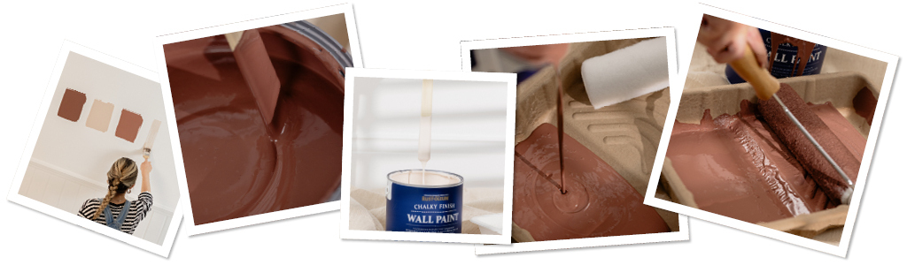


Why these colours?
From Unexpected Red Theory to the rise of Plaster Pinks, the Blushed Collection emulates popular trends with a diverse palette of pink, beige, brown and red tones. Whether you prefer the opulence and drama of Follingsby and Faded Ember, or the soft, sweet subtlety of Smitten and Eleanor, this collection has the right shade of red or pink to suit your style.
Blushing couples
You asked for more pinks, and we answered! With a blushed, dusty feel, the red undertones throughout this collection allow the shades to interact with each other, so you can mix and match for the perfect colour combination. Read on to find out our favourite pairings and how to style them.

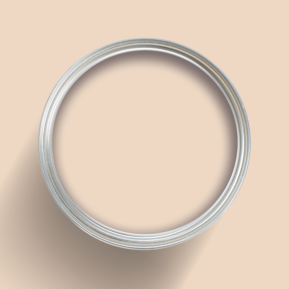
Eleanor & Smitten
Classic pale pink Eleanor and trendy plaster pink Smitten are a match made in heaven. This combo is perfect for creating a gentle, welcoming entrance or softening the cooler tones of marble and metallic kitchens. The subtle difference between a muted pink and an earth toned pink allows you to create an elegant backdrop in one shade, with delicate accent furniture in another, adding depth and interest without bombarding a space.

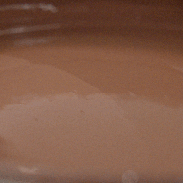
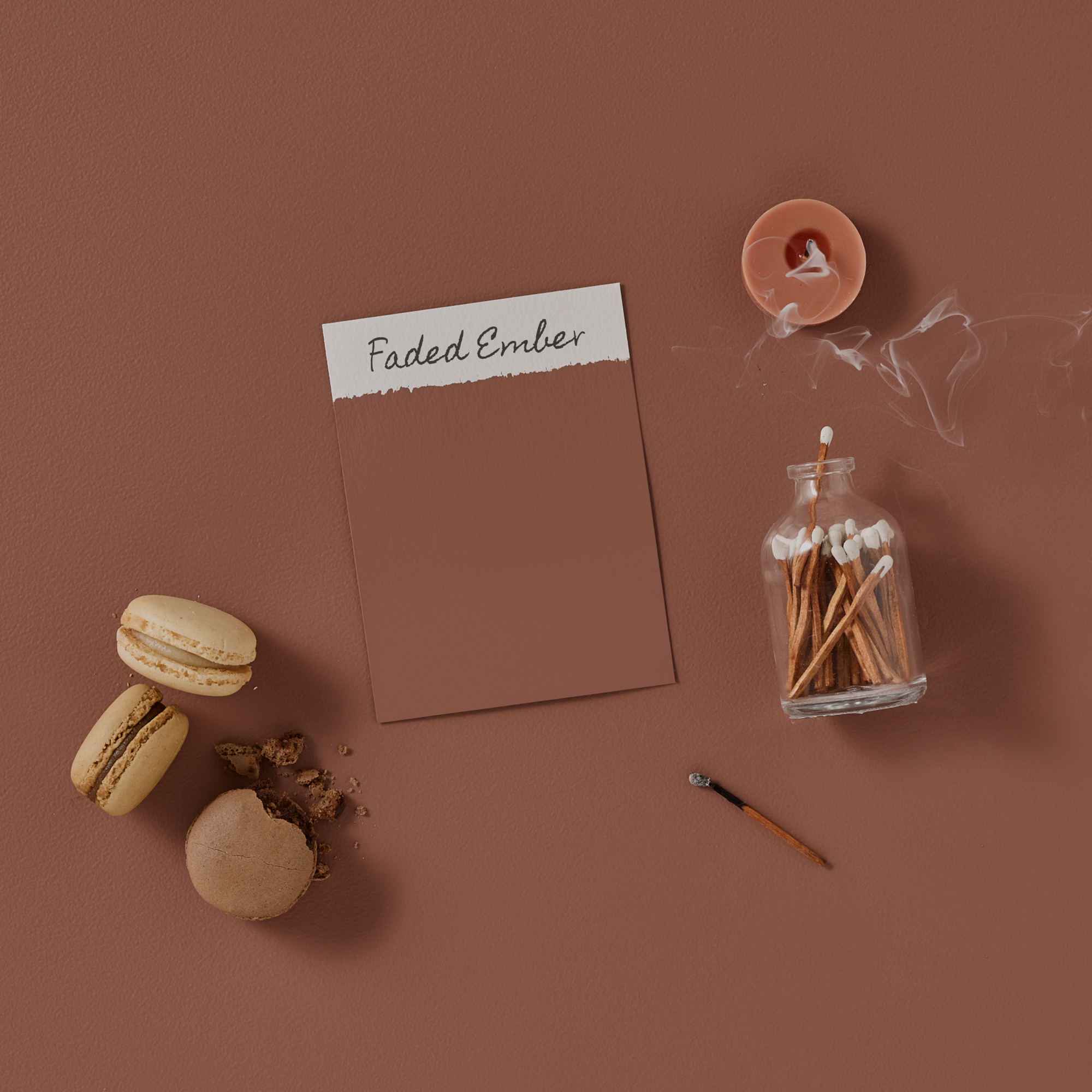
Smitten & Faded Ember
Unexpected Red Theory doesn’t have to feature pillar box red! Laid back Smitten and bold Faded Ember are ideal for a botanical look with a touch of grandeur. Our dusky Faded Ember will inject a more sophisticated warmth into earth toned spaces, for that surprising element that brings the whole look together. Incorporate Faded Ember into your Smitten pink scheme with a ¾ stripe, or pair furniture and ceramics with dried flowers and dark woods for a natural, sepia vibe.

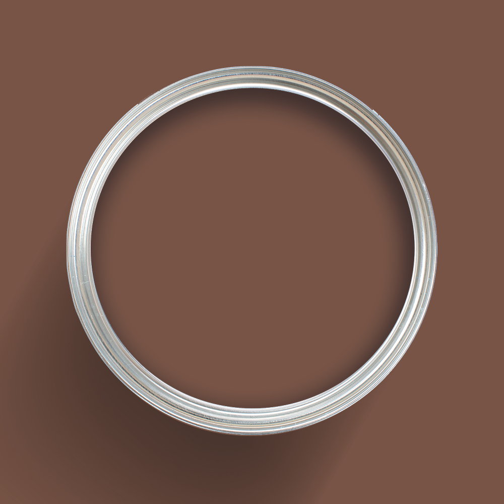
Eleanor & Follingsby
Muted pink Eleanor and muddied red Follingsby form a timeless pairing that’s equal parts playful and graceful. Paint walls pale pink Eleanor for a charming backdrop, and accent with Follingsby on doors and trims, to add a sense of sophistication to a light and airy space. Alternatively, painting ceilings in Follingsby will create a cocooning vibe, making larger rooms feel more cozy.