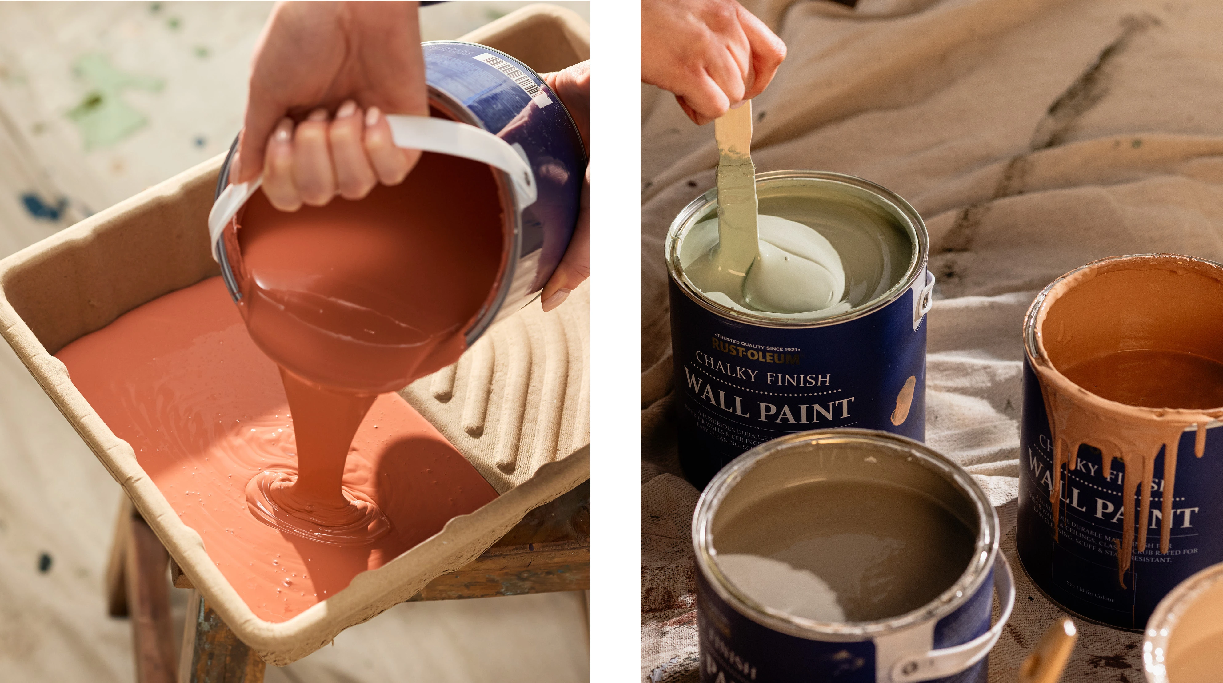
What is colour psychology?
Understanding colour psychology in interior design is an easy way of creating the right kind of atmosphere in your home. Each colour has its own association and influences how you feel, for example, yellow is associated with optimism and joy, while purple is associated with sophistication and luxury.
Read on to find out about different colour associations and how to convey that mood in your home.
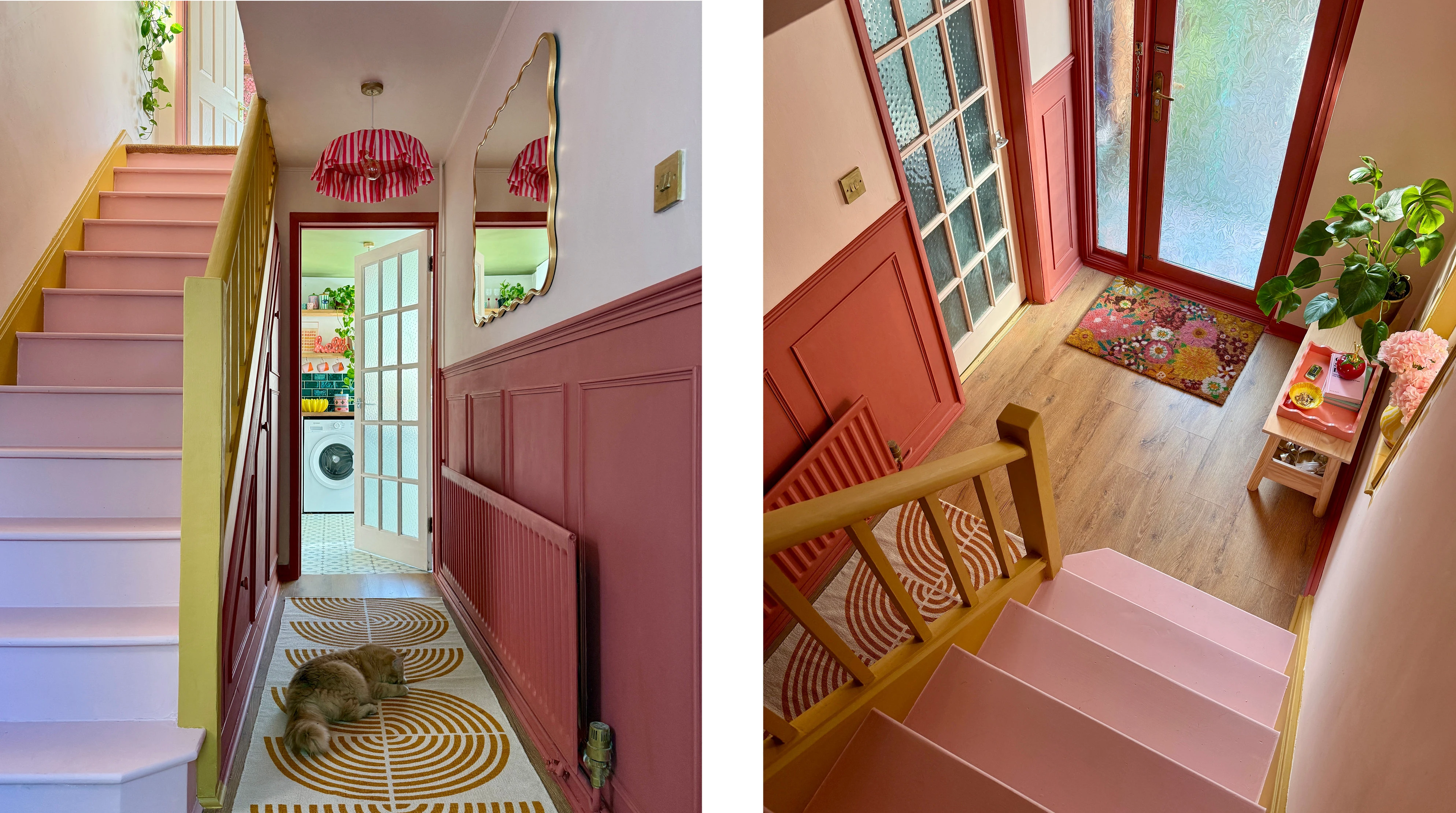
Left and right: Melrose walls, Salmon radiator and woodwork, Dijon bannister and Pink Champagne stairs by @the_shoestring_home
Restorative green
Associated with lush foliage and rolling hills, green is soothing and restorative, due to its links with the natural world. Light greens are perfect for creating an airy, refreshing vibe, while darker greens are grounding and cosy.
Our warm, earthy green paint Bramwell is restful and relaxing, pairing beautifully with floral prints to complete the natural look. Due to its earthier feel, it looks great with our warm, brown-toned pink Homespun for a delicate cottagecore vibe. For a more muted shade, try our mid green Grounded, as its strong brown undertones create an organic, cocooning space.
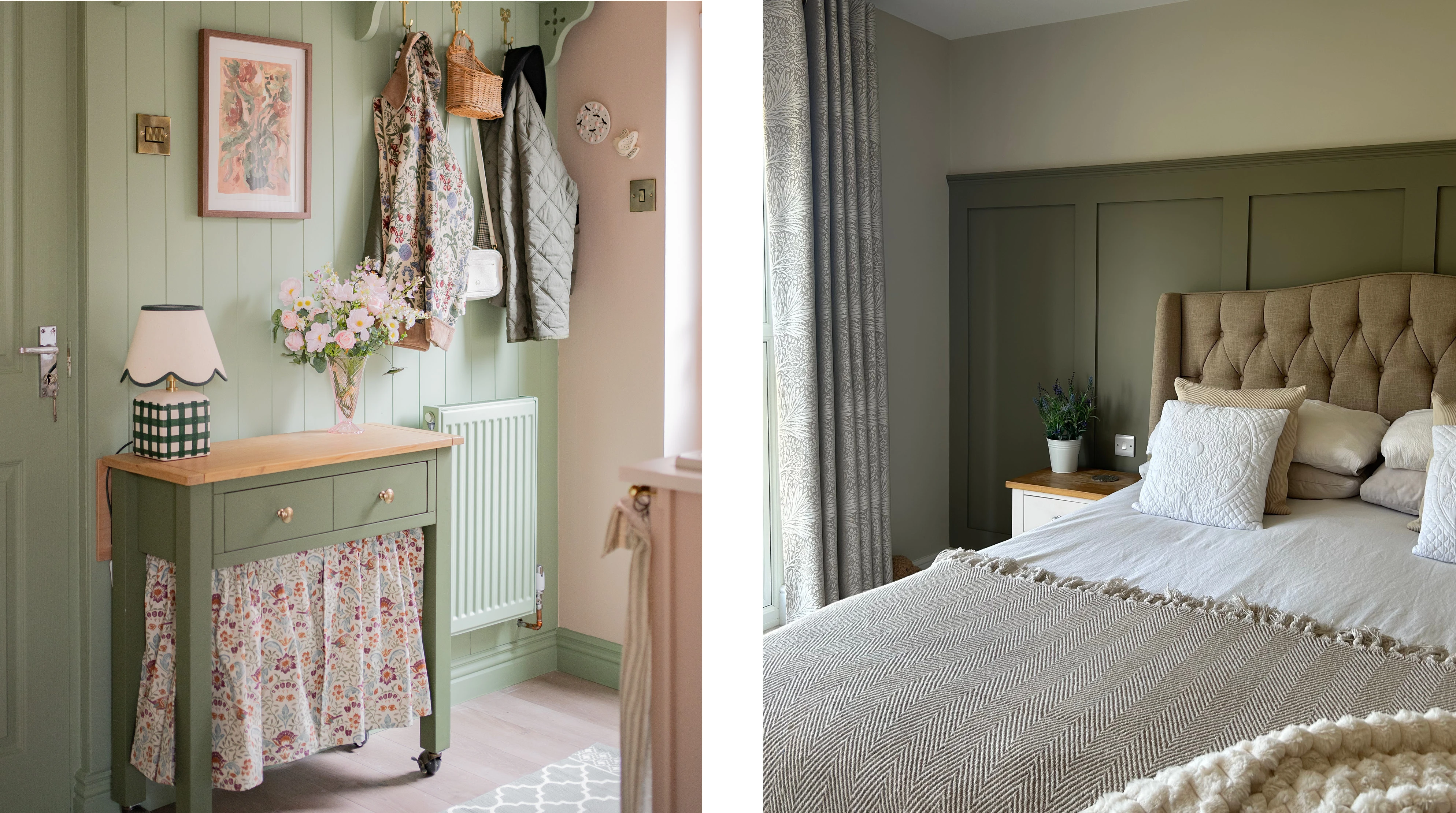
Left: Bramwell interior wood, Homespun wall by @pagesofemma
Right: Grounded woodwork by @projectno61
Joyful yellow
The colour of joy and optimism, yellow will instantly lift your spirits and create bright, cheerful interiors. Yellow is a popular shade as it is said to promote well-being and inspire creativity.
Representative of the sun and sky, yellow and blue are a match made in heaven and create a vibrant summer vibe. Try pairing our grey-toned yellow paint Sandstorm with dusky Wedgwood blue Nan’s Best China for a high-contrast look. For a more sophisticated shade, our earthy mustard Dijon is perfect as a colour drench, filling spaces with a cosy golden glow.
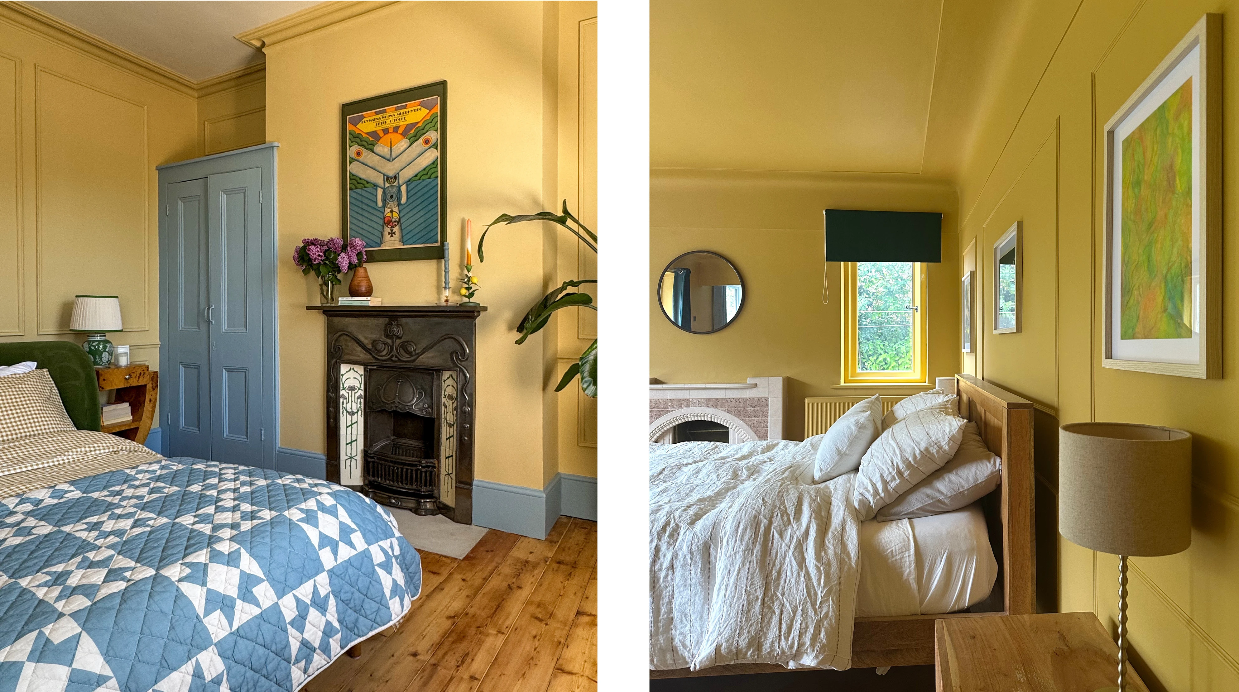
Left: Sandstorm wall, Nan's Best China woodwork by @thistimeincolour
Right: Dijon wall by @inside_the_painted_door
Uplifting pink
Calm and comforting, pink is associated with warmth and security. A delicate shade of pink paint is perfect for creating a sense of tranquillity, functioning as a soothing neutral in both vibrant and minimalist spaces.
Our muted, blush pink Eleanor has subtle yellow undertones, pairing beautifully with other yellow-toned shades such as dusty olive and warm Antique White. Incorporate floral prints and leafy green plants to complete the serene, natural atmosphere. For a brighter, more playful vibe, our dusky Pink Champagne is both inviting and glamorous, its warm undertones look great with regal, red-toned purple Mulberry Street.
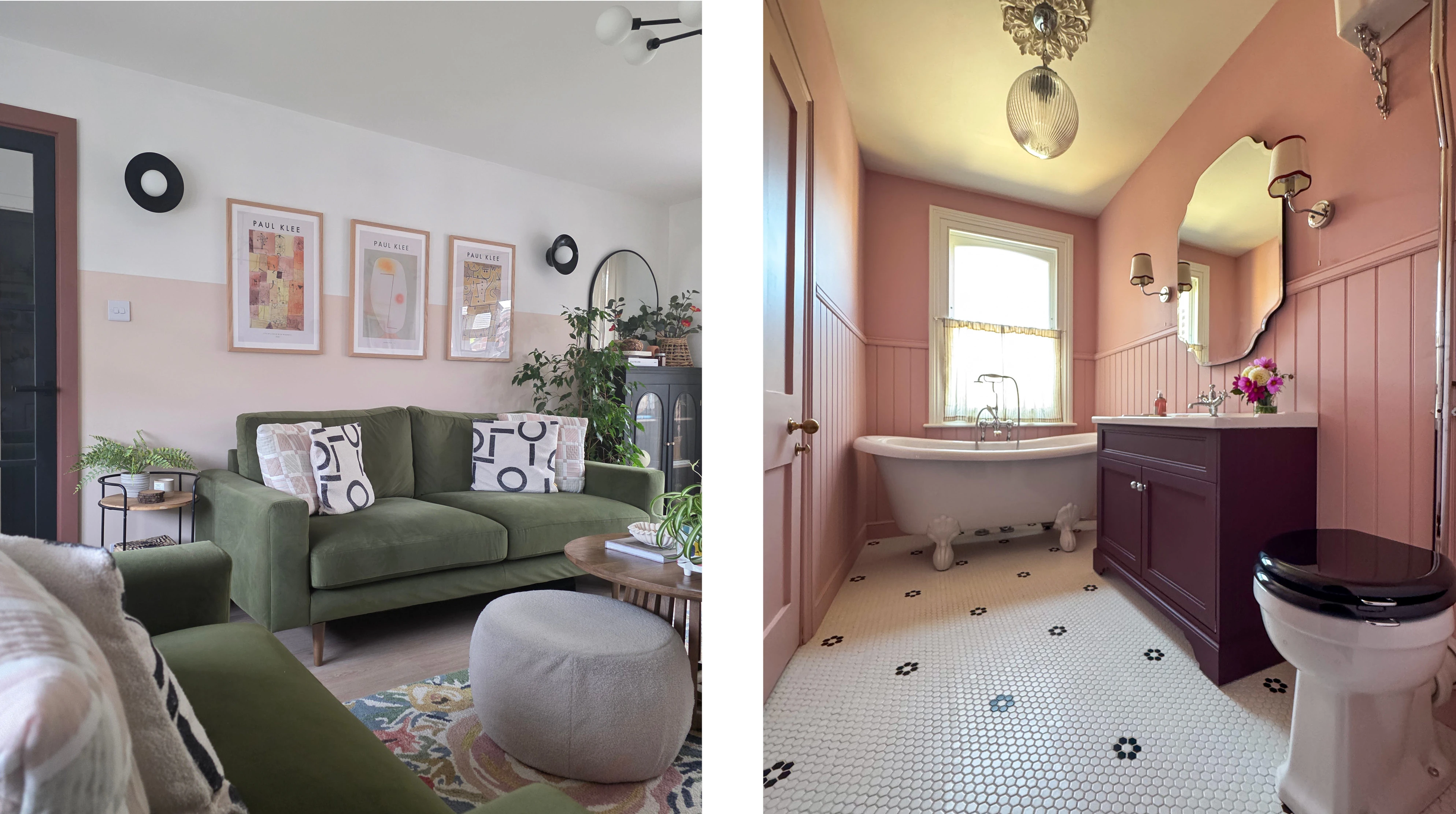
Left: Eleanor, Antique White wall, Faded Ember woodwork by @all_things_interior
Pink Champagne bathroom wall and wood, Antique White bathroom wall, Mulberry Street bathroom cabinet by @thistimeincolour
Calming blue
Blue is associated with feelings of calm due to its connections with water and clear skies. A timeless colour choice, blue paint is extremely versatile, making it a great companion for a wide range of colours, including white, orange, blush pink and mustard yellow.
Dark blues are associated with confidence, loyalty and trust, making it perfect for a welcoming first impression i.e. on your hallway or front door. It also looks great in a bedroom, as it promotes rest and introspection. Our deep Evening Blue looks tranquil and elegant on these built-in wardrobes, pairing effortlessly with pale grey Mocha walls, green-brown Grounded floors and a blush pink rug.
Lighter blues are gentle yet refreshing, perfect for spaces where you relax and unwind. This tonal palette of various blues creates a coastal effect in this bathroom, pairing pale blue Marcella tiles with a dusky Blue River cabinet and a green-toned Gresham Blue wall.
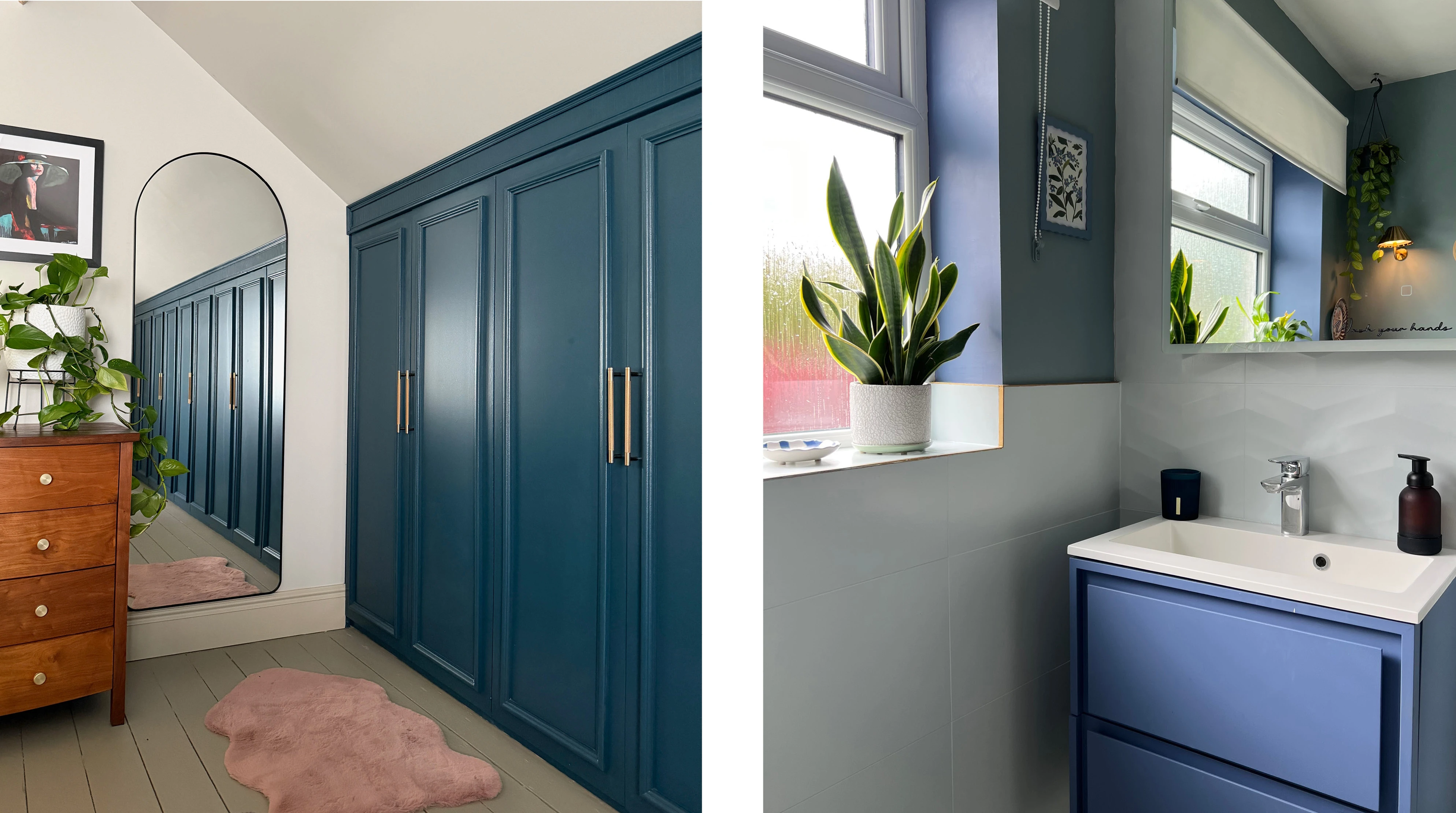
Left: Evening Blue furniture, Grounded floor and Mocha walls by @fromevijawithlove
Right: Marcella tile, Blue River cabinet, Gresham Blue wall by @charnwoodtowers
Energising orange
Exciting and inspiring, orange paint is perfect for creating vibrant, energising spaces. Its warm, inviting nature works particularly well in living rooms, kitchens and rooms where guests can get together and socialise. Orange can also inspire creativity, so it’s a good colour for a studio or home office.
A rich, saturated shade of orange, such as our bold Tiger Tea, looks striking when paired with slick black furniture or pops of navy décor. Try softening the shade with a cool, earth toned neutral like Half Light, to avoid dominating the space. For an earthier take on orange, try warm dusky terracotta Cinnamon, for a grounded, Mediterranean look.
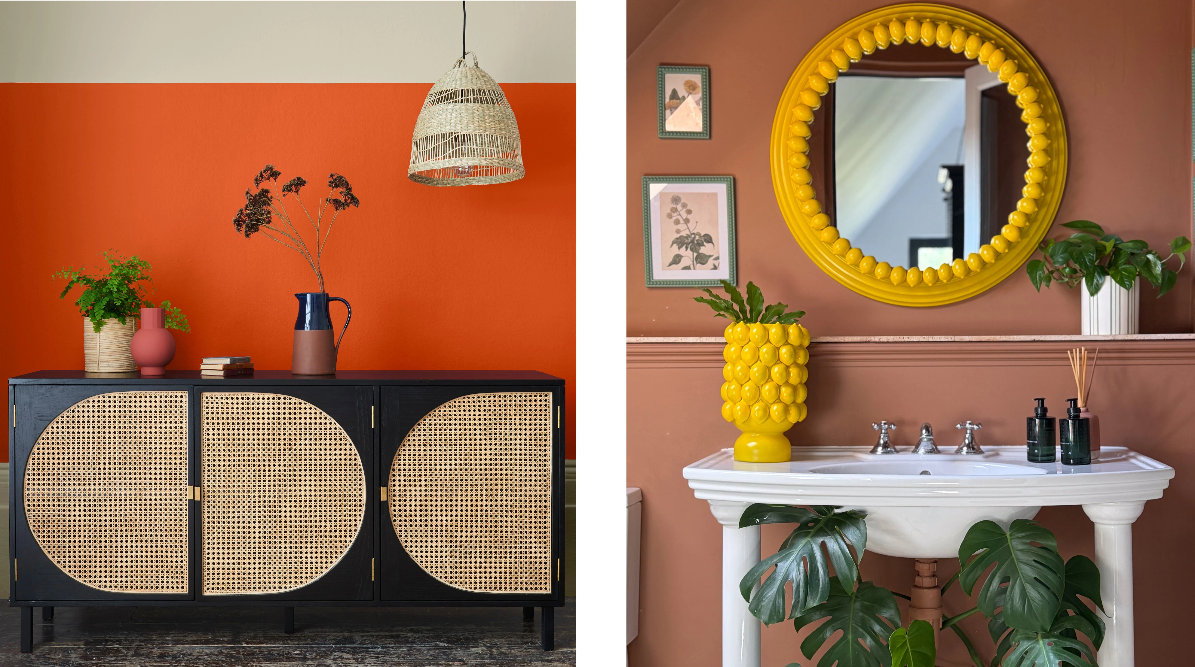
Left: Tiger Tea, Half Light wall
Right: Cinnamon wall by @jackkinsey
Powerful red
The psychology of the colour red is passionate and intense, meaning it instantly captures your attention. Powerful and regal, red paint dominates a space, whether in the form of a commanding colour drench or a strategically placed accent. This fiery shade is perfect for filling a room with warmth or creating an eye-catching focal point.
Our deep bold Empire Red makes for a majestic backdrop, pairing effortlessly with intricate patterned fabrics and soothed with accents of leafy green. Incorporate cooler shades into your red colour schemes, such as dusky blue or crisp white, for an appealing contrast. For something a touch more subtle, our red-brown Salmon has an earthy, baked look, perfect for a more grounded space that’s just as captivating.
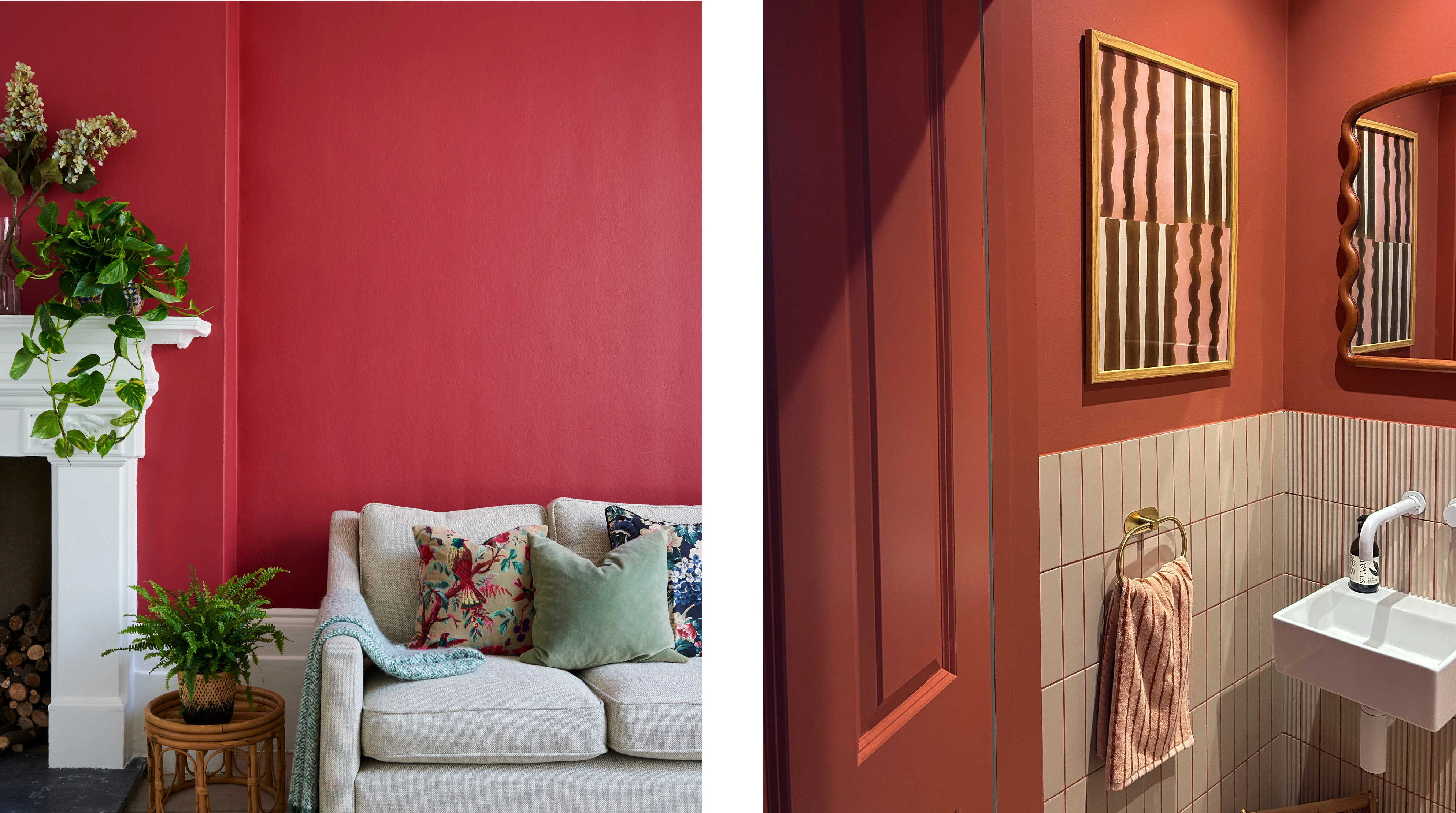
Left: Empire Red walls
Right: Salmon walls and grout by @amelia_home_edit
Majestic purple
Associated with drama and luxury, purple paint is perfect for creating an elegant and sophisticated space, and it has even been known to inspire creativity, artistry and imagination. Purple is a particularly captivating shade as it combines the serene nature of blue with the fiery energy of red.
A rich, red-toned plum like Mulberry Street implies opulence and grandeur, whereas a gentle lilac such as Violet Macaroon creates serenity with a more minimal sense of elegance.
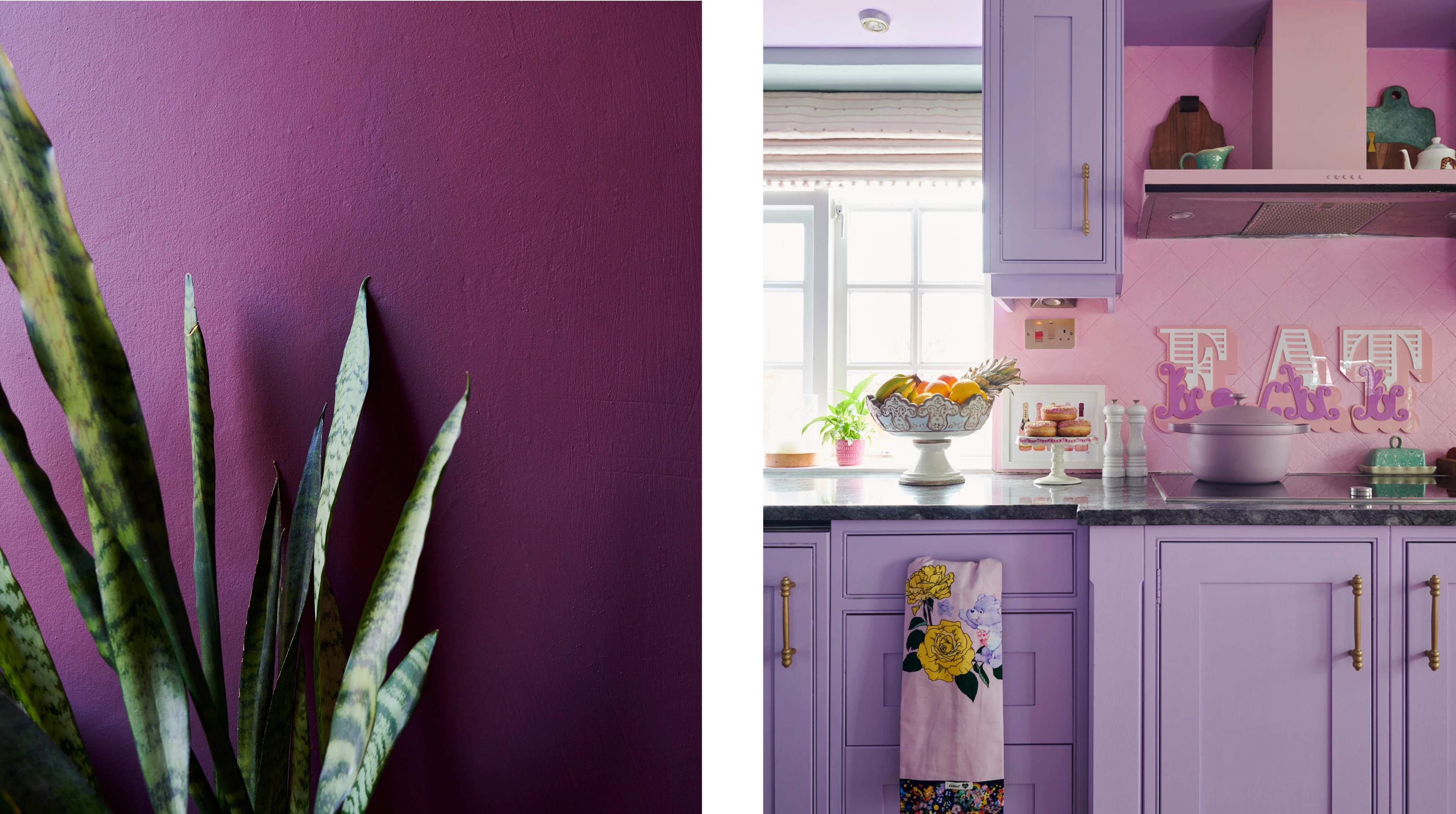
Left: Mulberry Street wall
Right: Violet Macaroon cupboards
Still deciding on the right shade? Check out our blog post on how to choose the right colour for your space. If a slow-paced palette is more your thing, take a look at our blog post on getting to know neutrals.