How to decide on the right colour for your space
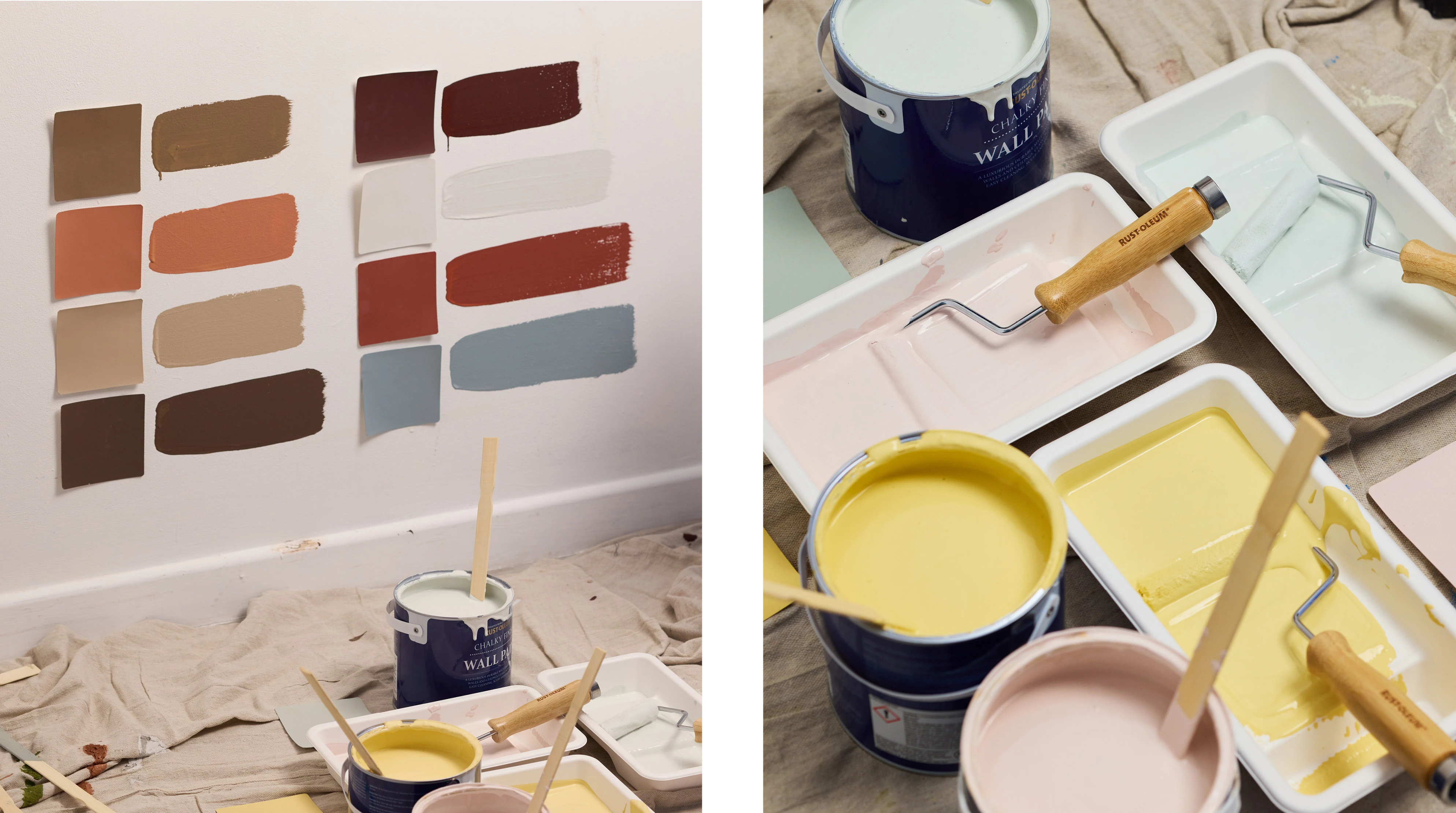
Deciding on the right shade for your space can be challenging, as there are a few elements to consider, such as how much natural light a room has, or whether you prefer a contrasting or tonal colour palette.
Read on to find out how to choose paint colours that look great in your home, while matching the mood you want to create and your own personal style.
Consider the lighting
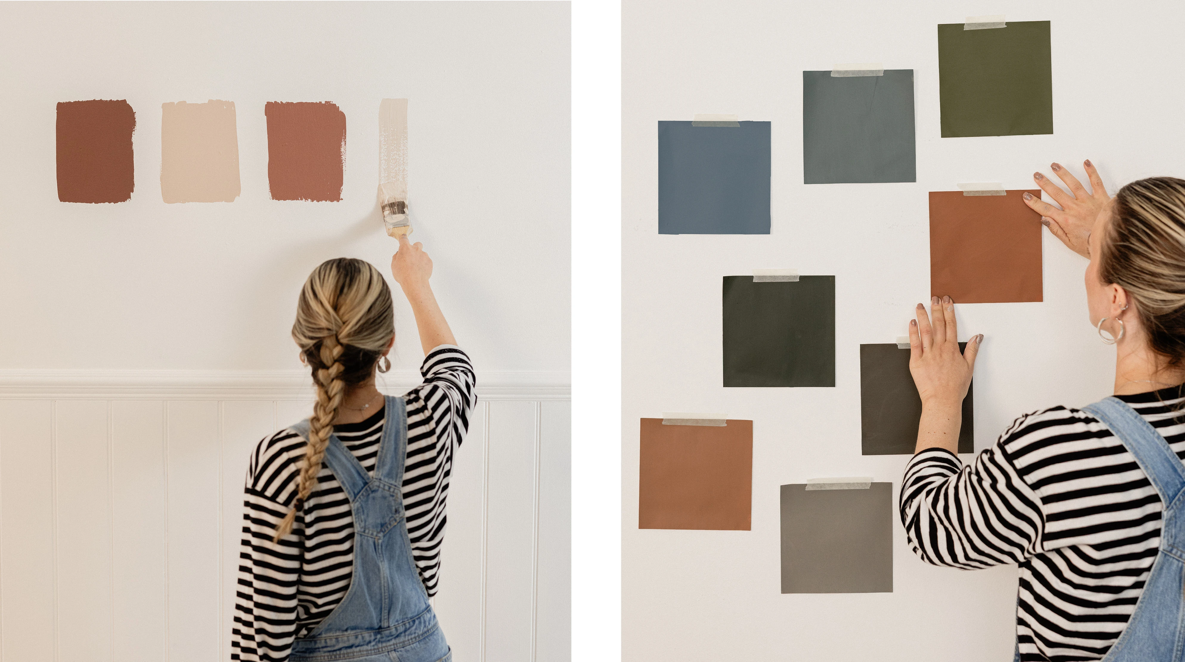
When researching paint colour ideas, a good place to start is observing how much natural light your room receives, and whether it is north or south facing.
North facing
North facing rooms are known for receiving the least amount of light, and the light they do receive appears cool. Colours with red, orange or yellow undertones work well in north facing rooms, as they add warmth. Our cherry red Valentina appears burgundy in this dark, north-facing kitchen, when compared to the light-filled bathroom on the right, which gives it a richer, warmer feel.
It’s generally a good idea to avoid blue, grey or green undertones in north-facing rooms, as they can make the space feel too cool.
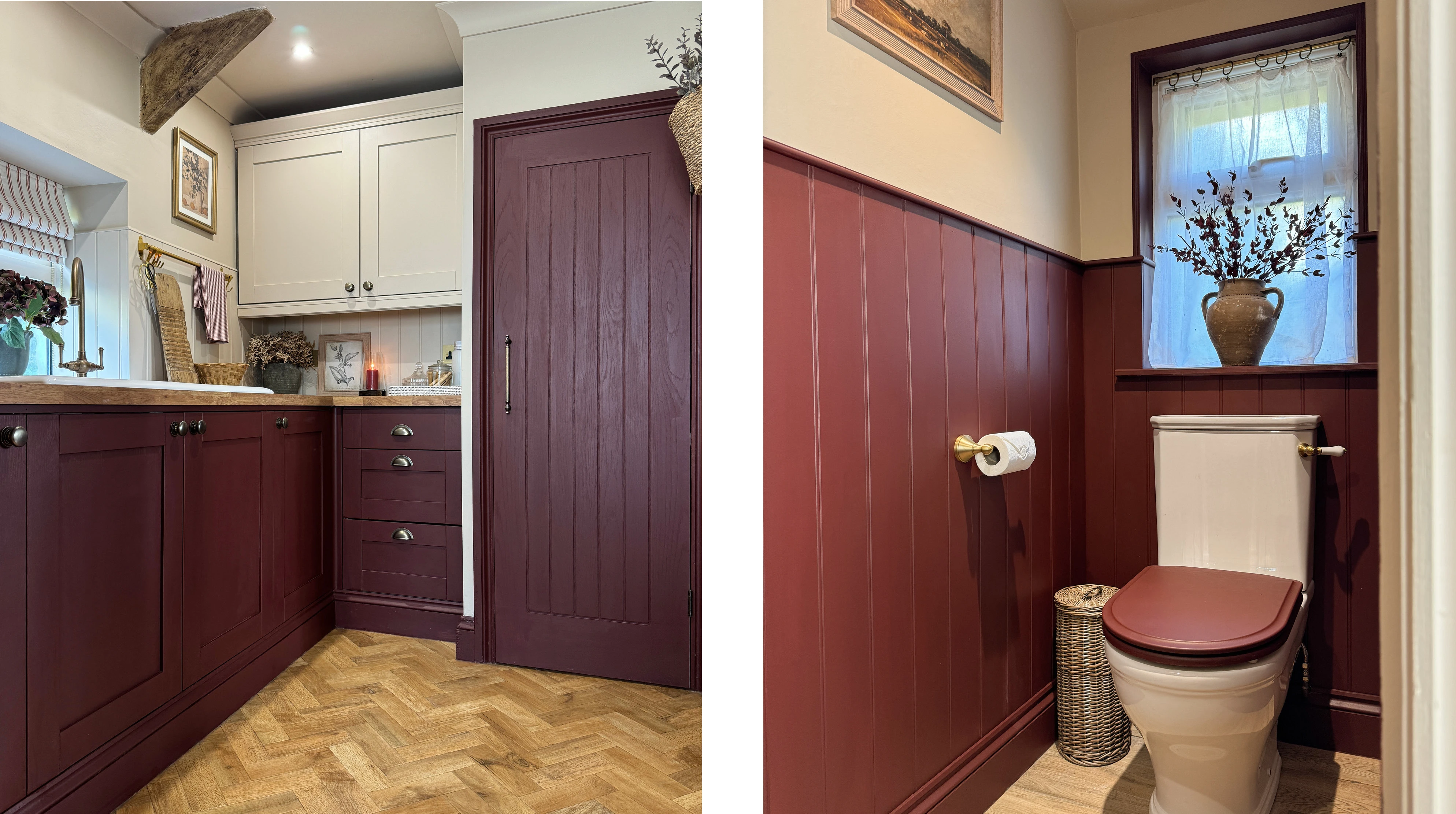
Left: Valentina cupboards and Warm Clay walls by @cottagerenovationcwmrhys
Right: Valentina panelling by @cottagerenovationcwmrhys
South facing
The majority of colours tend to work well in south facing rooms. However, you might wish to choose a cooler shade with blue or green undertones, as warm colours may appear more yellow due to the vast amount of natural light. Compare how our smoky blue-green Deep Sea appears in the bright south-facing kitchen on the left, to the dark staircase on the right.
Find out more with our handy blog post on north and south facing rooms, or check out our tester sachets, so you can experiment with how different colours look in different lighting.
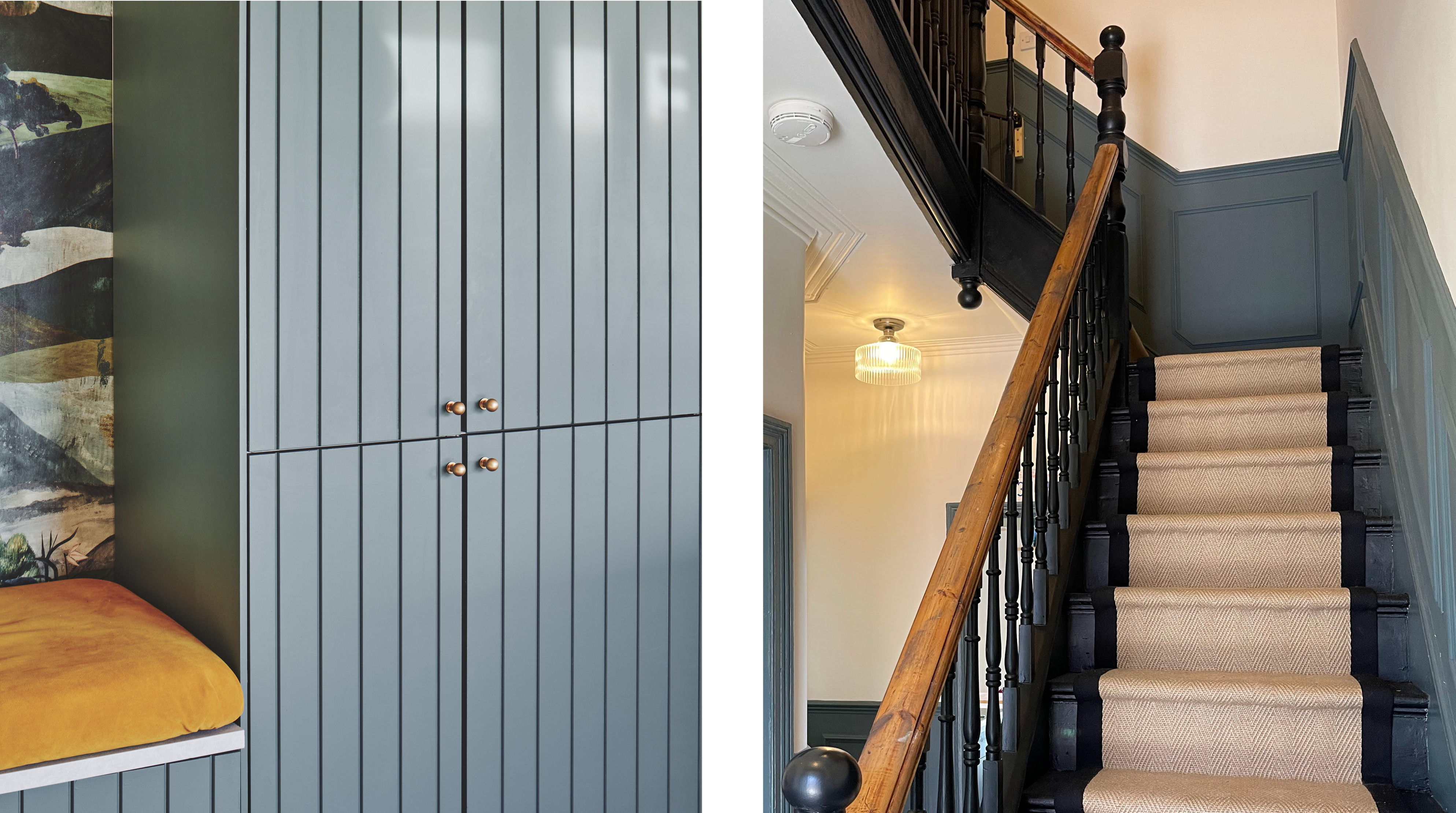
Left: Deep Sea cupboards
Right: Deep Sea wall panels, Natural Charcoal bannister by @its_a_fixer_upper
Contrasting shades
If you’re looking for bold, showstopping interiors, a contrasting colour scheme is for you. One approach is simply contrasting the backdrop with an accent colour on furniture or woodwork. Pink and green look great together, as the lighter pink Coral on this bedroom wall strengthens the intensity of deep Greencroft.
For a striking, warm vs cool look, try pairing our soft Wedgwood blue Nan’s Best China with earthy red Fire Brick. Select muted or dusky shades to ensure that the contrast doesn’t overwhelm the space. Take a look at our blog post on complementary colours for more information on which shades pair well together.
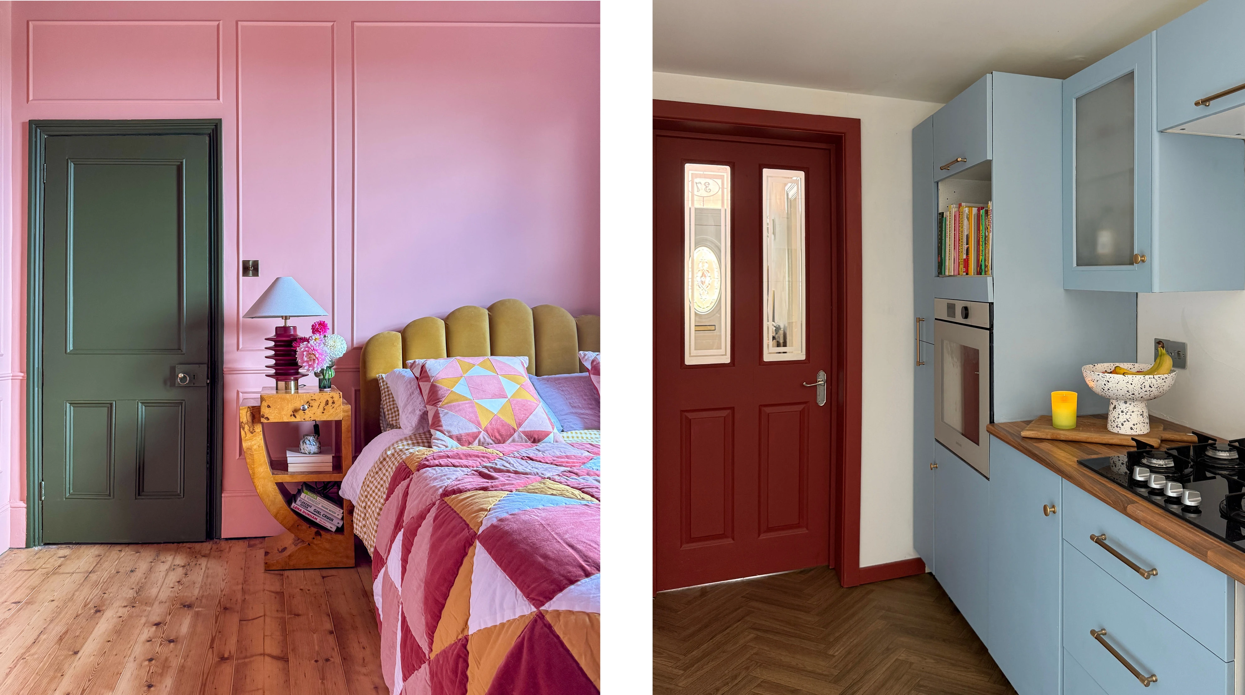
Left: Coral walls, Greencroft door by @thistimeincolour
Right: Fire Brick door, Nan’s Best China cupboards, by @emeraldterrace
Tonal palettes
If restful and understated is more your style, we recommend a tonal colour palette. A tonal scheme involves pairing two or more shades of the same colour e.g. light green and dark green. The gradient from light to dark creates a harmonious flow across a space, adding depth and interest while effortlessly pulling everything together.
Sweet Nothing is a delicate neutral with a hint of pink, meaning it blends beautifully into our soft, brown-toned plaster pink Homespun. These blushing pastels have been paired with pops of dusky green Bramwell for a cottagecore look. Similarly, our soft, light Laurel Green offsets darker, duskier green Serenity on the kitchen island.
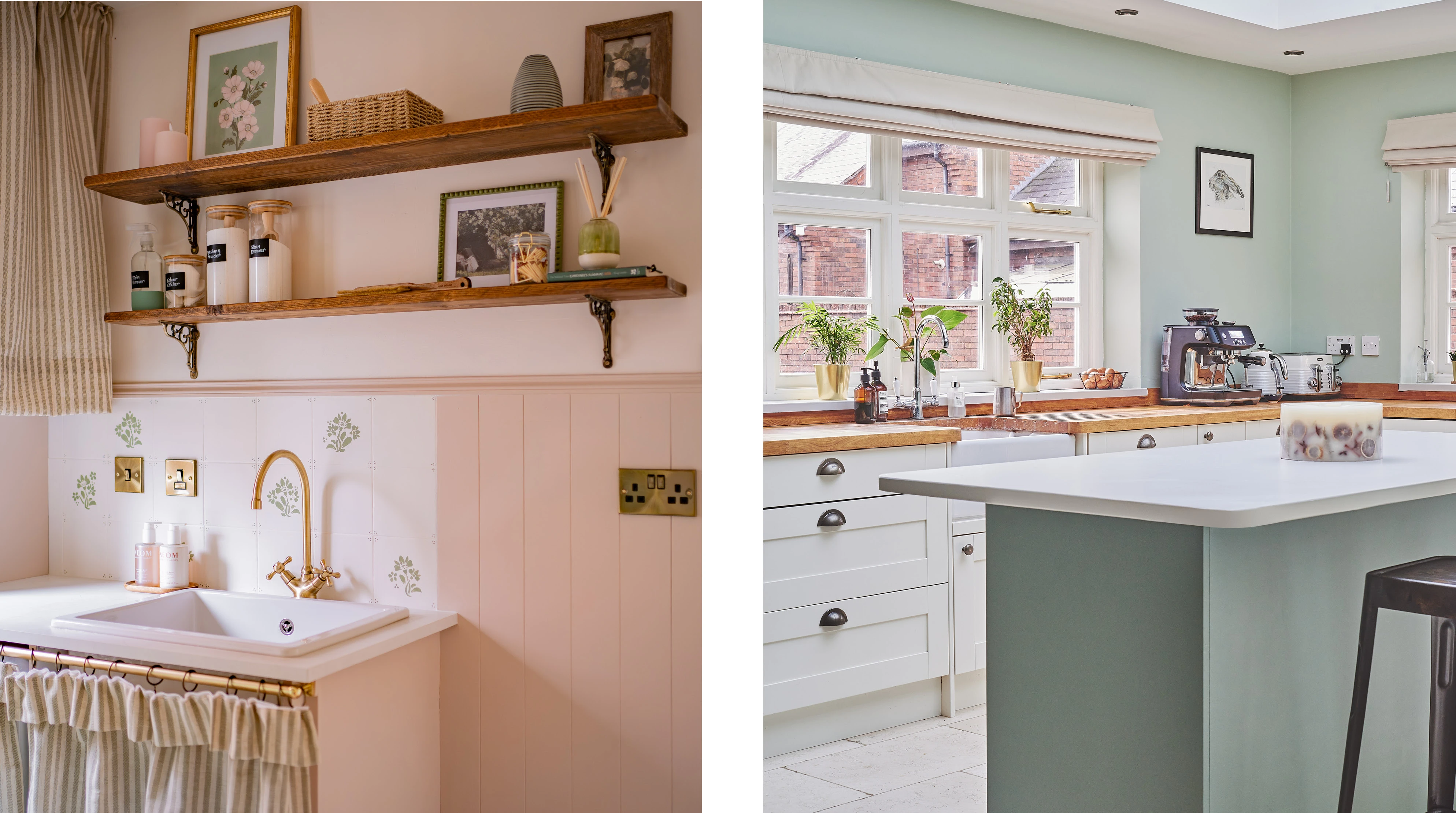
Left: Sweet Nothing wall, Homespun panelling, Bramwell stencilled tile by @pagesofemma
Right: Laurel Green walls, Serenity cupboards
If you’re ready to get started, explore our full range of 150 colours or take a look at our tester sachet boxes to help you decide on a shade. Looking for more paint colour suggestions? Check out our blog post on this year’s trending shades.