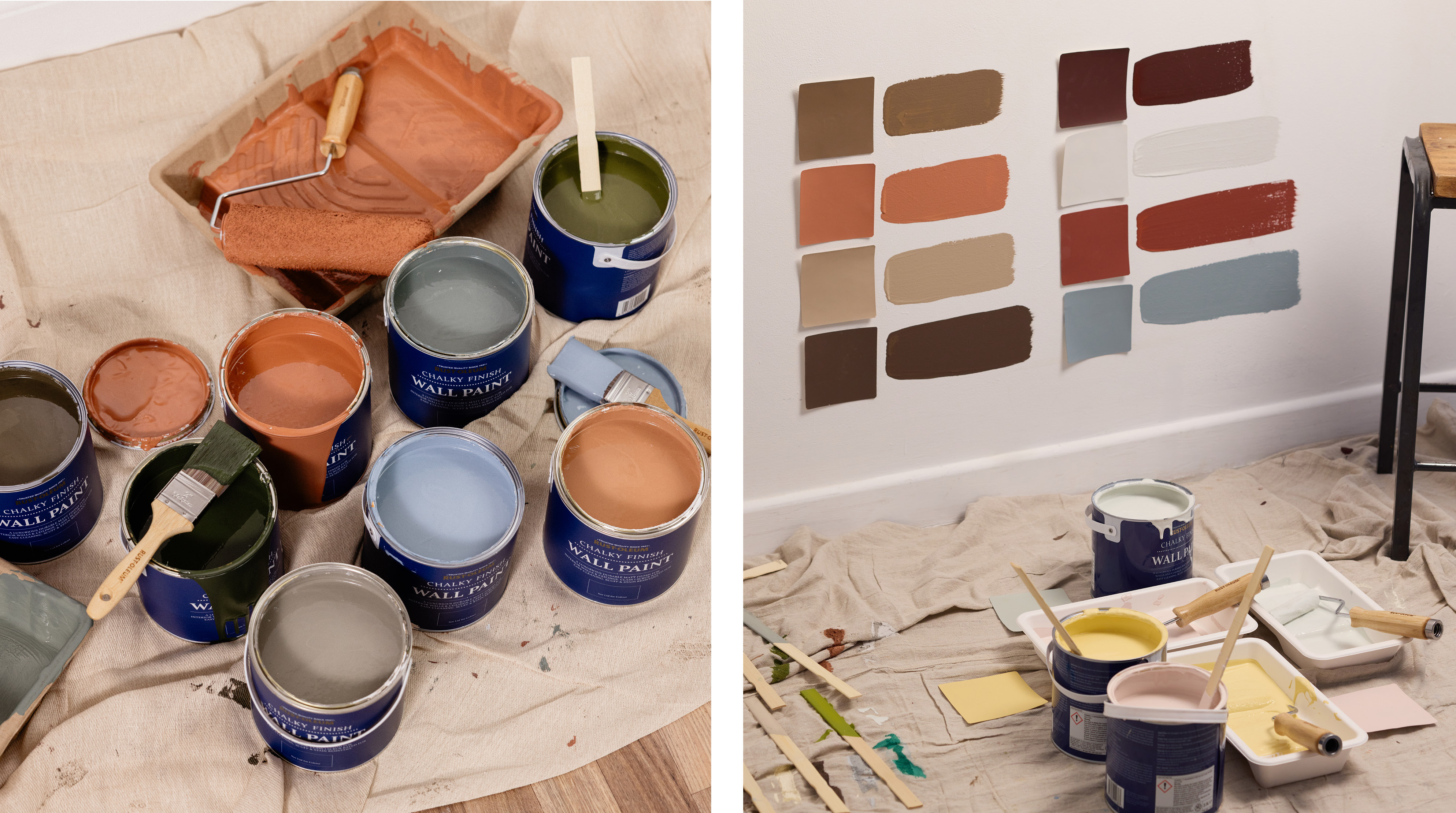
What are complementary colours?
Complementary colours are the shades that sit across from each other on the colour wheel, such as blue and orange, red and green, or purple and yellow.
These strong contrasts can make an impact in any space, but you can also pair muted variations of these colours for a more understated look. Read on to find the perfect complementary pairing for your home.
What is the complementary colour of blue?
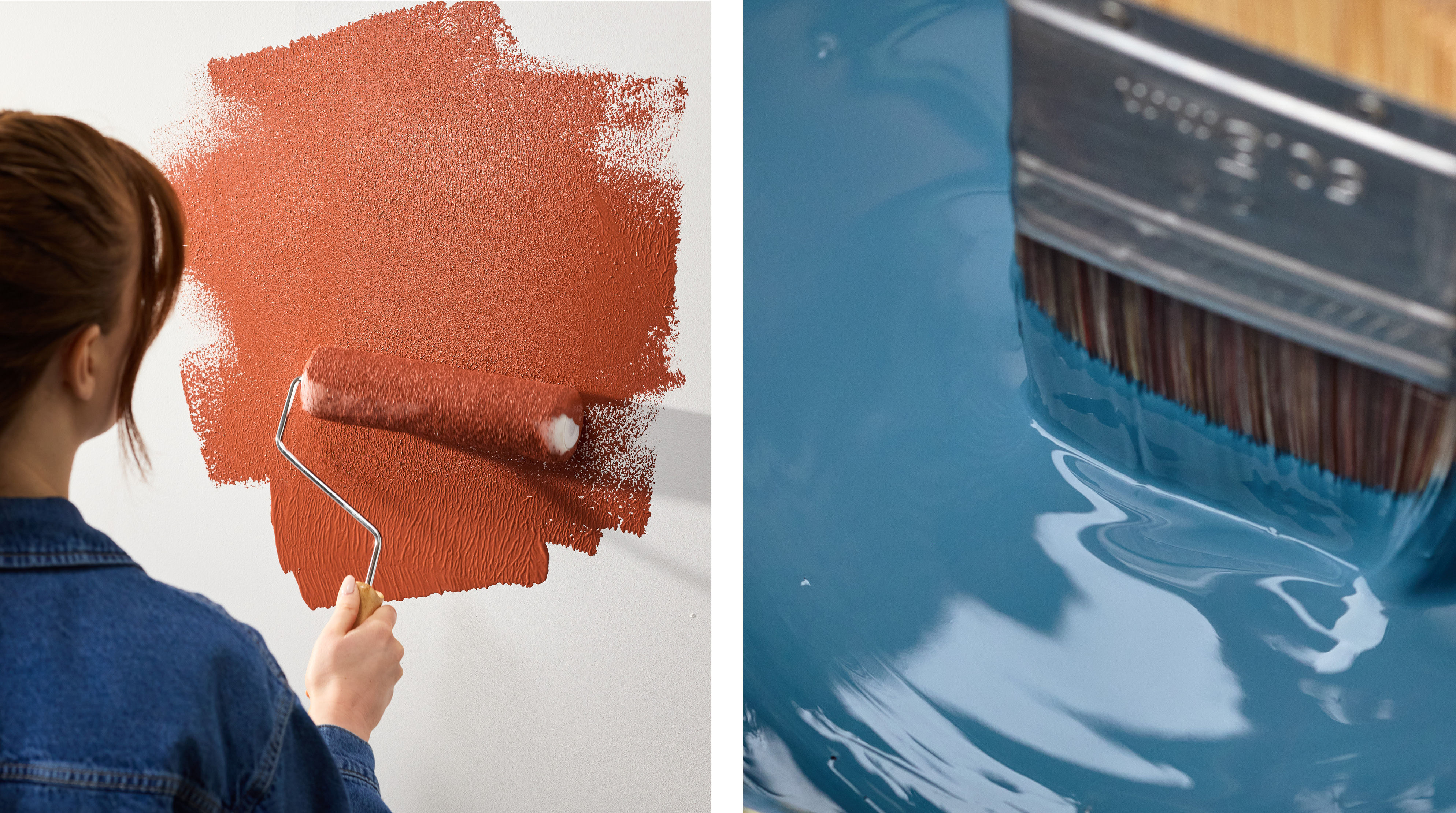
Our smoky blue-green Deep Sea pairs effortlessly with this vibrant orange sofa, as the muted blue softens the intensity of the orange. Perfect for a bold look that isn’t overwhelming. Similarly, this front door has been painted in our dark and moody Evening Blue, contrasting beautifully with the bright orange brickwork.
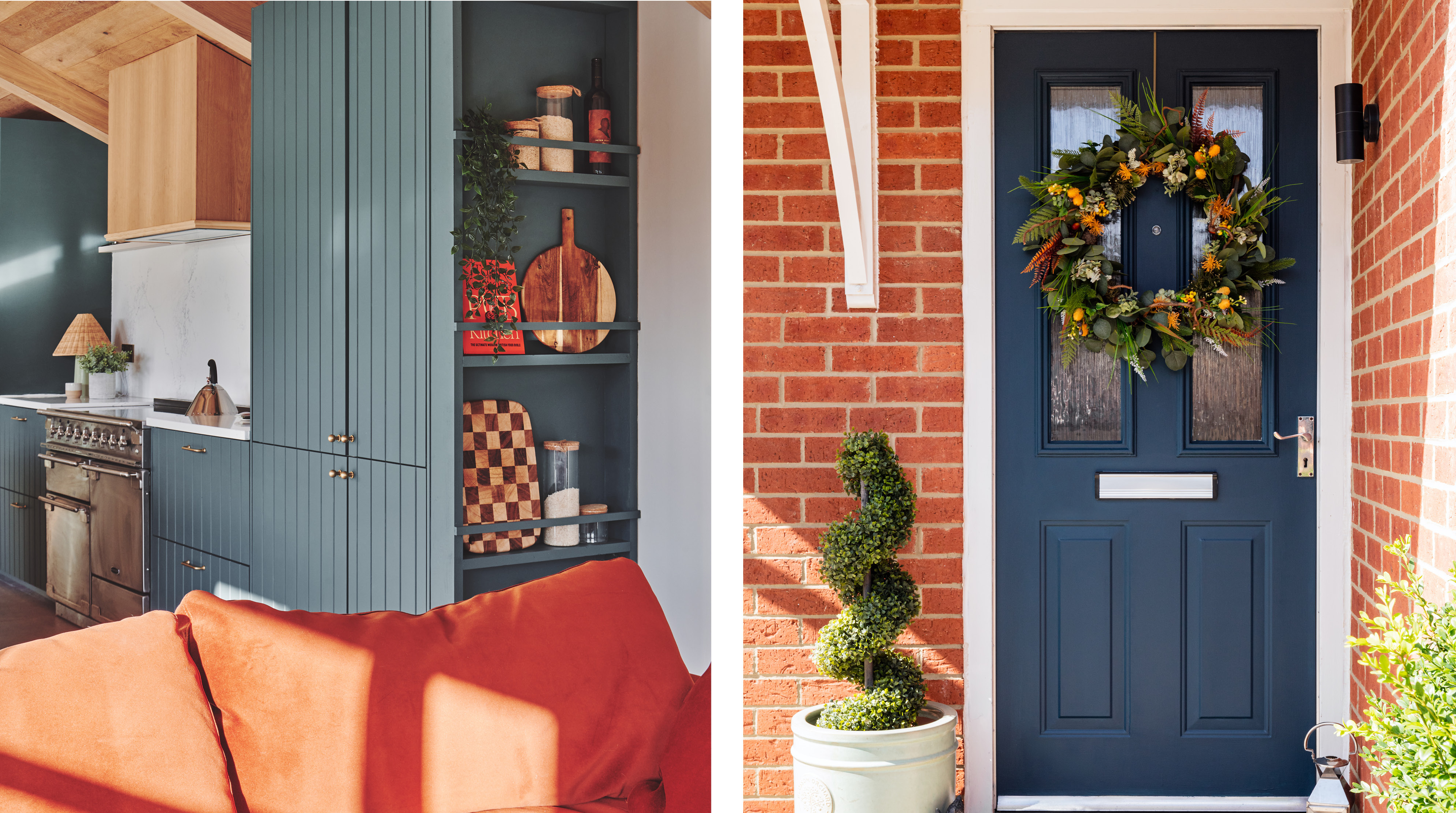
Left: Deep Sea cupboards, Portland Stone walls
Right: Evening Blue front door
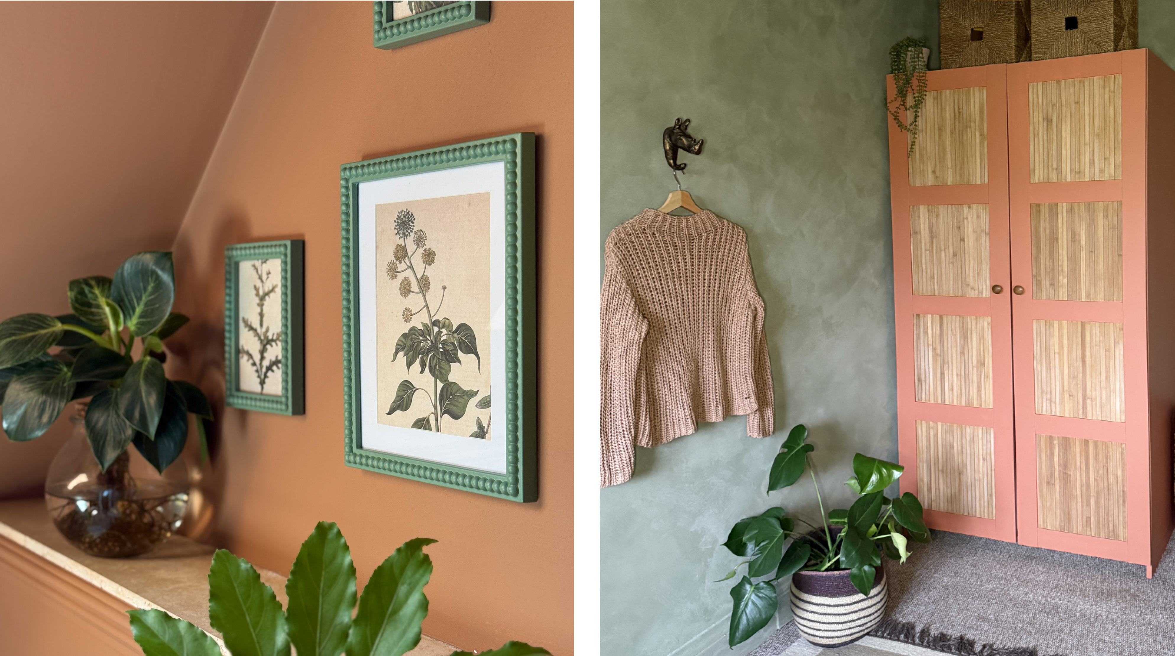
What is the complementary colour of red?
A classic terracotta like Siena or a weathered red like Faded Ember is the perfect companion to rich olive or sage green decor. You could also incorporate a pink-toned neutral like Sweet Nothing to the scheme to balance a rich red and green palette.
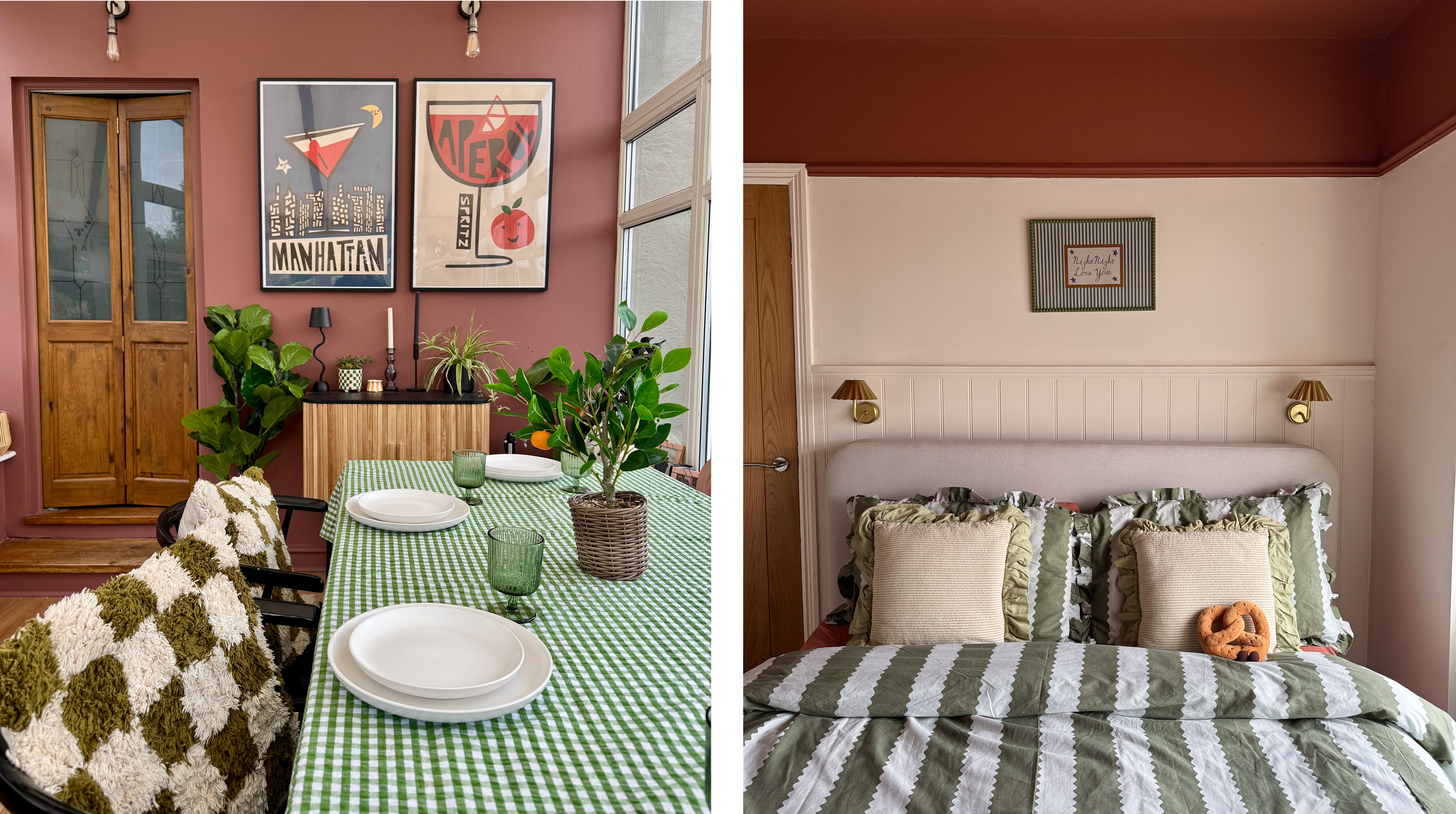
Left: Faded Ember wall by @thegreenwoldgaff
Right: Siena ceiling, Sweet Nothing by @churchsidehome
What is the complementary colour of purple?
The warmth of sunshine yellow Lemon Jelly pairs well with the delicate coolness of Violet Macaroon. Perfect for playful kids’ rooms.
Add a summery vibe to gardens with our dusky, pink-purple Lilac Wine. Add pops of yellow with outdoor furniture or cushions to complete this soft yet joyful look.
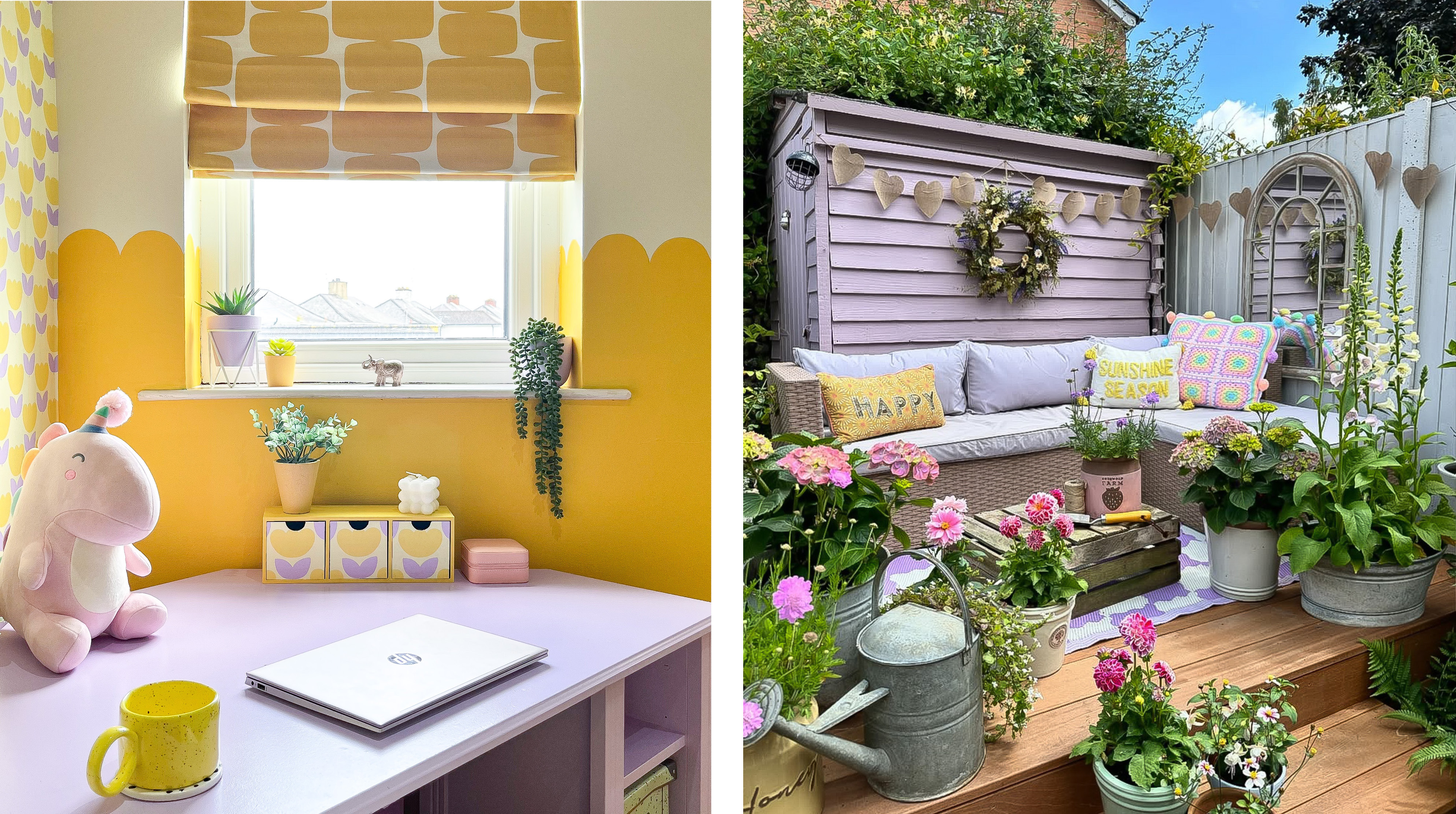
Left: Lemon Jelly wall, Violet Macaroon desk by @hilaryscolourfulhome
Right: Lilac Wine shed by @acorn_cottage_
Alternative pairings
Pink and green
Red and green are considered true complementary colours. However, pink and green also look great together too, as pink is simply a lighter tone of red. Try pairing vibrant, orange-toned Coral with deep Greencroft for a striking contrast. Alternatively, our warm, yellow-toned pink Eleanor pairs beautifully with a dark, earthy green for a softer look.
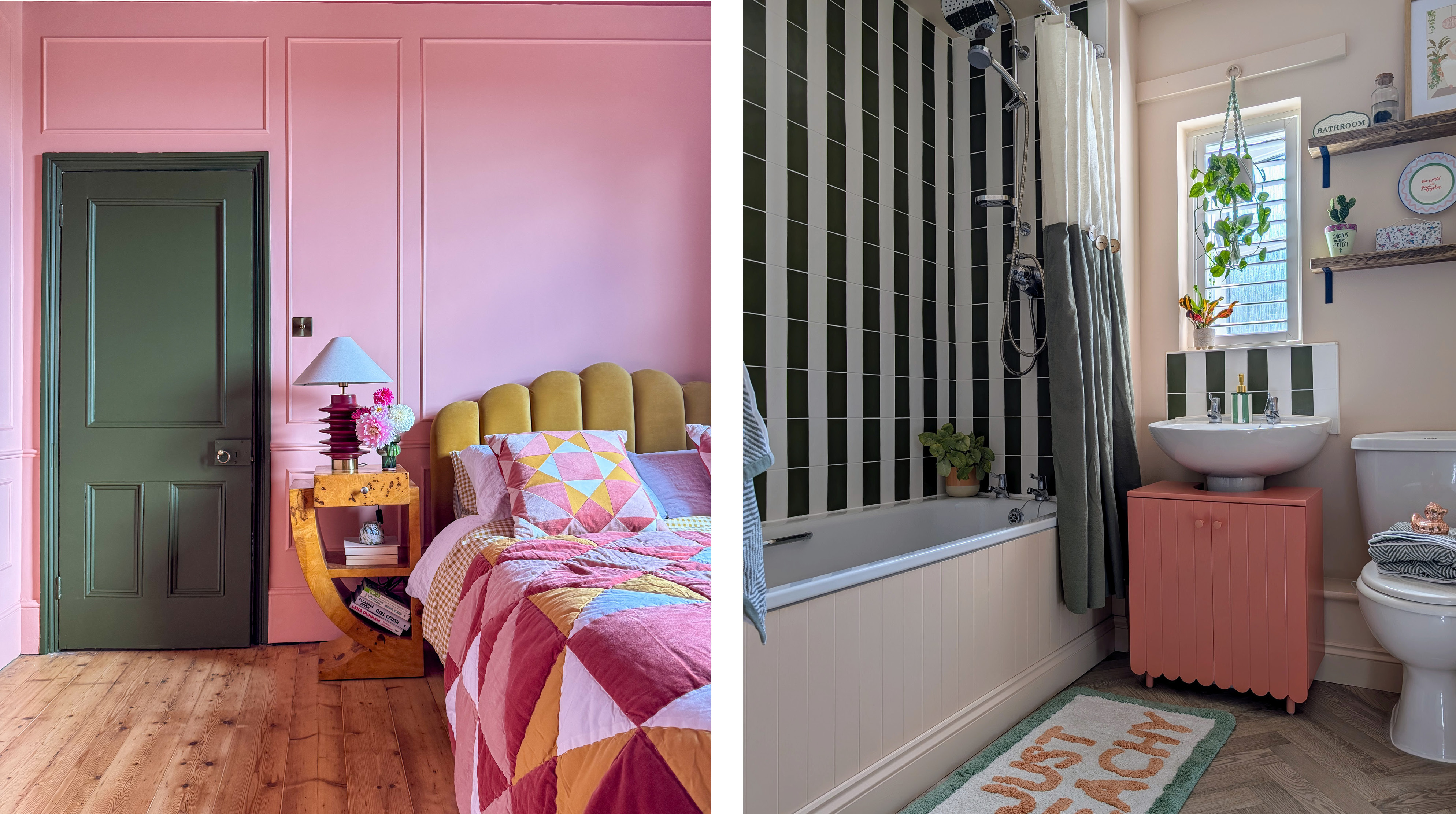
Left: Coral wall, Greencroft door by @thistimeincolour
Right: Eleanor wall and bath, Greencroft and Still tiles by @thatruralhome
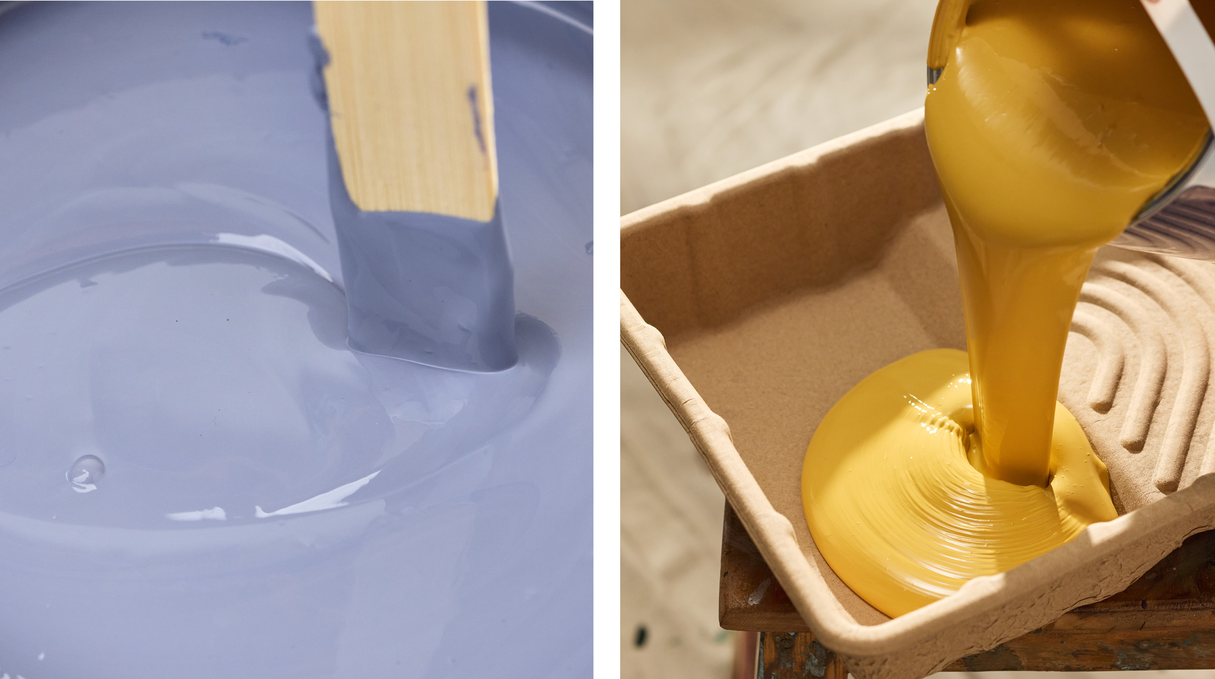
Blue and yellow
Blue and yellow are not direct complementary colours, but are often paired together to create a bold, high-contrast look. An intense dark blue such as Cobalt or Evening Blue looks striking when paired with our mustard yellow Dijon, creating a visually pleasing contrast of warm and cool.
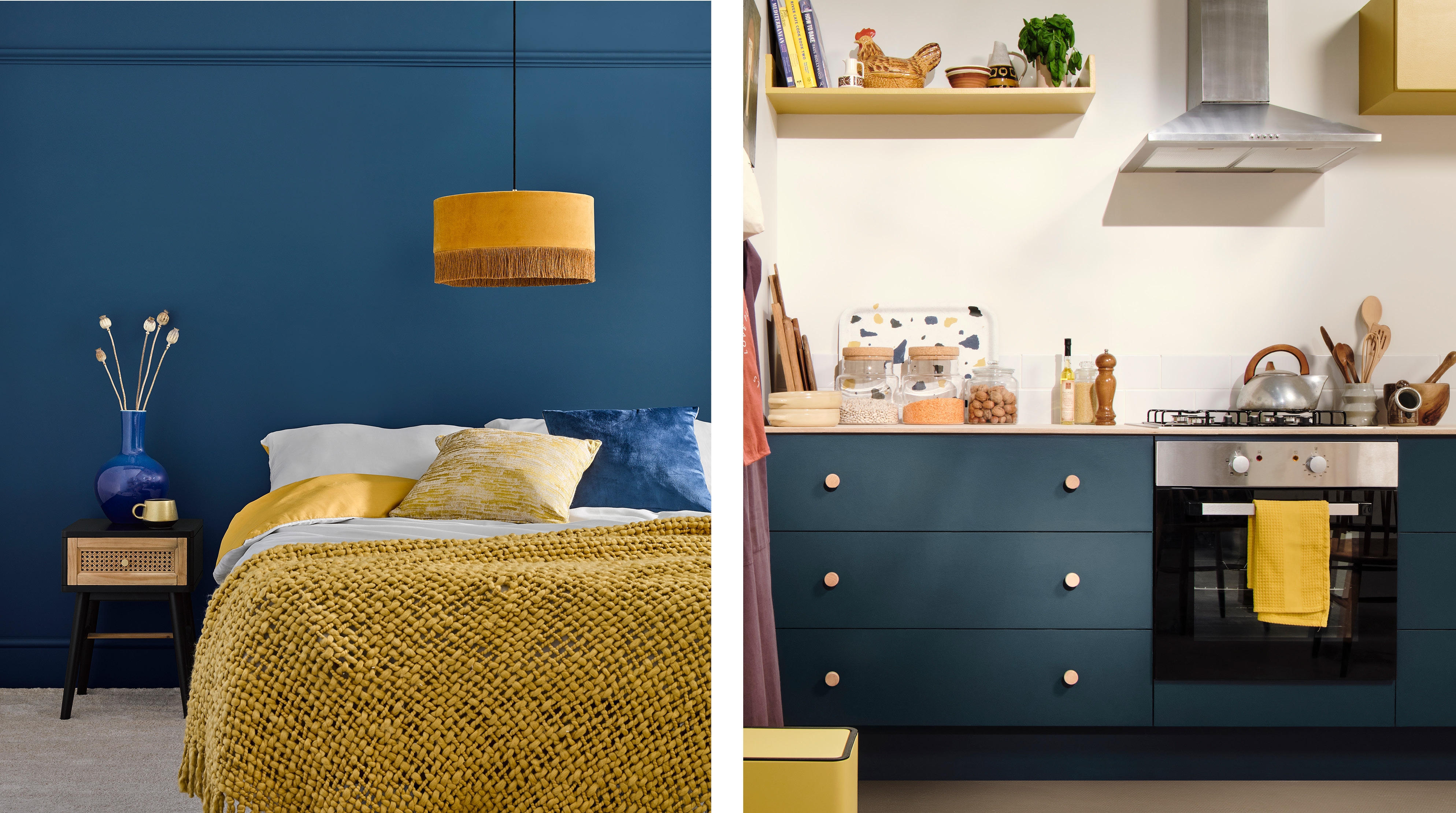
Left: Cobalt wall
Right: Evening Blue and Dijon cupboards, Steamed Milk wall
Orange and green
Although orange and green are not directly opposite each other on the colour wheel, they still create a bold contrast, as orange is a close match to red. We recommend pairing warm dusky orange Cinnamon with an earthy green like Bramwell for a sun-kissed, retro look. Our green Limewash No. 482 looks great with classic terracotta Siena.
Left: Cinnamon wall by @jackkinsey
Right: Limewash No. 482 wall and Siena wardrobe by @casacrank
Feeling inspired by these matching shades? Discover our wall paint to get started, or explore our complete range of bathroom, kitchen, exterior paints and more.
Take a look at our blog post on this year’s trending colours to find the perfect shade to suit your space.